Wednesday, 2 March 2016
Friday, 26 February 2016
Do's and don'ts
Do's and Don'ts
below are some do's and don'ts we are aiming to keep this year while filming .
Do's
Bring a spare SD Card for more filming shots .
Take more than one of the same shots
Take a spare camera
film with confidence
Have fun while filming
use rule of thirds
stick to the storyboard
Don'ts
Have the cameras reflection in the shot
Don't rush each shot take time while filming
Don't have anyone speak other each other while filming
180 degree rule
Evaluation
Evaluation
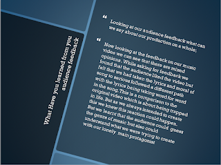
Below is my evaluation for the whole task. in this evaluation I have answered 4 questions below and used all of my knowledge to complete this evaluation and used audience feedback and media knowledge to complete this task.
Self Evaluate Past work
Self evaluation past work
Looking back and my past project and my contribution to the completion of the task video I would say that for last years video we stayed in a local location for our video and this was the only location used within the video as our ideas were not as broad as what we have used this year.
Last year we filmed our video all in one shot and as the video was short and the focus of the video was horror a film opening so the video out set was clear before we started. The shots we used were a lot of walking shots the basic shot as this filled up time and also we had more cast within the video last year as we were in a bigger group this meant we all had roles within the video and could complete the task much quicker.
looking at my contribution last year I can say that last year I was heavily involved with the creation of this task. I was in the film as one of the 4 characters, I also filmed around 50% of the video and I edited all of the video and would say that I created the majority of this task by myself. so what could I evaluate from this project and what could I learn not to do within the latest project.
Now looking at this years project I wanted to change my whole approach to shooting the video for example on shooting we chose a much larger and more ambushes video with filming on location in London with us moving around a lot more to 3 different locations within central London. This was one of the do's that I wanted to complete as I felt before I video was a bit boring and location was very vague and I wanted this to change so we decided on a bigger location, a risk but one I was willing to take.
This year our aim is to record our video in the least amount of takes but not to rush it like we did last year, thus why our video look some what rushed so I would like the video to be taken time and if we have to go to London again then we will. learning from last years mistakes I hope we are able to create a good video. remove bad camera shots and unnecessary shots that where used last year. did hold down the production of this video
Looking at my contribution this year compared to last year I can say that this year I want to be more on the filming side rather than editing as I want to have more of a role with the creation rather than getting left to do the editing and would like to focus more on the filming side and creative side of the production and still edit.
Friday, 12 February 2016
A2 Meida Magazine page design (final)
Above we have our final Magazine page design for our music video. this consists of showing off the design which was created on Photoshop. to create this page from a magazine we have used the same concept as our ancillary task with the mind of both being able to correlate our music video Living in a box as you can see the page design has the element of cardboard. Which was one strong element we wanted to portray in our Ancillary tasks, so that element is consistent throughout each design. looking more into detail you can see our main lead singer on the poster. we decided that having him in the centre of the page was key to the narrative of the song but also the video as you would be able to link him to the song which is the most important part. Coming out of the box seen here is the storyline behind the whole project the story follows Steven on his travels to a happier time in his life and the video shows that with his journey being the main element in the video. so we had time to think of how we could incorporate that into the page design and the CD cover. The picture of him coming out of the box. So this is seen on both the Magazine and also he cover of the CD , this helps you link the two together.
Having Steven on the magazine page was a decision that we took as looking at other examples of poster/Magazine pages they all include the artist giving off the impression that this is new by that artist will sell. so for us having that link of narrative with the front cover including our main headliner was important to us.
A2 Music Video Preview
Here is our Music video so far the video is not complete but this is what we have produced so far the video takes from the song Living in a box the song follows a journey in Stevens life and when he decides to do something different and make a move out of his daily life and find his past.
I feel what we have produced so far is good and really shows what is to come towards the end of this video .The whole video is based on a story, a story about life and when sometimes life can be bad but only you yourself can change that for the better.
A2 media focus group
Above is a video of our focus group for our music video. For this we asked 3 questions to a audience of 2 these questions were based on the music's background. the questions include what type of music genre was this after you watched the video? . This focus group gives us some good feedback on what we have produced. so far and gives us a indication to what out audience thinks of our production.
Thursday, 11 February 2016
Main Protagonist Special item
Main Protagonist Special item
A2 Magazine page rough design
A2 Magazine page rough design
 |
| Magazine page designs |
Storyboards
Storyboards
Above is the storyboards for our music video, this is a detailed view of what happens within our video. these storyboards are designed for any one to pick up these templates so they could continue filming if needed. it is a long story board with lots of shots needed and changes in the location. This is the final design of the storyboard. Which shows the story of the main protagonist on his journey.
Friday, 5 February 2016
Cast, Props and Location.
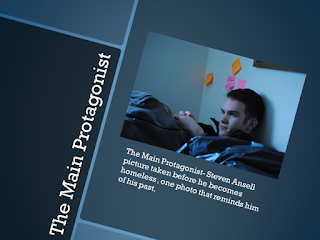
Below is a detailed in depth look at our cast, props being used and the locations being used with our video.
 |
| Title |
 |
| Cast list |
 |
| Main Protagonist |
 |
| Props |
 |
| Homeless |
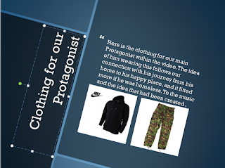 |
| Clothing |
 |
| Locations |
 |
| Locations 1 |
 |
| Locations 2 |
 |
| Equipment |
Above shows what we aim to create and how we have come up with the idea and also we show the cast, Props and locations in which we intend to shoot.
Media A2 Magazine cover analysis
Media A2 Magazine cover analysis
Below is a analysis presentation of magazine covers we looked at these for inspiration for our magazine page design.
Target Auidence
Target Audience
For our music video the target audience is
that the previous targeted audience when the video and music was first released
back in 1987. At the time of the music being released Living in a box, were a
young boy band making regular appearance on Top of the pops with their music
reaching out to younger audience teens. The song released in 1987 was a good
vibe song, with catchy lyrics and a back tune which allows for the video that we have grated to target those very same
audience today, as the music will be recognisable to them and will bring back
memories of their past hopefully sparking more interest within the industry.
This is for the narrative of the task to keep the audience
the same as when it was released, we feel that the video would appeal to the
older audience who have experienced this before and could relate to the
narrative of the song whereas teen of today. Might not link to the music or the
video as in today’s music genre. Livin in a box has not got the social backing
or fan base that would promote this type of music to today’s teens.
We took to the streets with our questionnaires that we
created in hope of getting some important information on our video. In the
survey we asked 30 random people, questions from our survey and the results
were a mixed bunch. Many of the results were based upon asking a younger
generation of audience their answer were as we expected with most of them list
liking todays chart music and preferring solo artist to groups and most music
is now being downloaded off the internet than buying the album from a shop and that younger people today would not really listen to this music and prefer the cart topping music of today which is heavily focused on younger people like music before. Companies push there music towards this audience as its a huge market with all types of music genre having a he fan base. However our audience survey did show that any older audience would listen and watch a older song from their past so a decision was reached for us to re-create Living in a box with a younger main focuses but still keeping to its roots of the older generation with the video and its messages .
Friday, 22 January 2016
A2 Media Magazine/ Poster final design
Above we have our final Magazine design for our music video. this consists of showing off the design which was created on Photoshop. to create this front page from a magazine we have used the same concept as our ancillary task with the mind of both being able to correlate our music video Living in a box as you can see the page design has the element of cardboard. Which was one strong element we wanted to portray in our Ancillary tasks, so that element is consistent throughout each design. looking more into detail you can see our main lead singer on the poster. we decided that having him in the centre of the page was key to the narrative of the song but also the video as you would be able to link him to the song which is the most important part. Coming out of the box seen here is the storyline behind the whole project the story follows Steven on his travels to a happier time in his life and the video shows that with his journey being the main element in the video. so we had time to think of how we could incorporate that into the page design and the CD cover. The picture of him coming out of the box. So this is seen on both the Magazine and also he cover of the CD , this helps you link the two together.
Having Steven on the magazine page was a decision that we took as looking at other examples of poster/Magazine pages they all include the artist giving off the impression that this is new by that artist will sell. so for us having that link of narrative with the front cover including our main headliner was important to us.
Overall I would say the subject of the poster was a successful one as it carries all the key features that we set out to create and also link the poster and the CD cover to our music video I feel that they follow the narrative of the song with the element of cardboard being used in both as the main element.
A2 Media Digipak CD cover final
Above is our final design for our Cd cover, for the design of our cover we decided on a theme of the box within the whole task that is why this and the poster look very similar that was our intention from the start of the planning. this is my area of design as I created this CD cover with a photo shoot of our main man within the video. The whole task is focused in on him and I feel that the CD cover portrays that with the cover showing him living within this book and his journey of escape to find the one place that means a lot to him.
so the cardboard box design being used was planned and used in the first initial design. using the inside of a box was key to setting the frame and the whole frame looks likes a box. the back cover consist of a list of songs from the best hits of the band living in a box the six over sings are the bands most recognizable songs I feel that the back cover looks good and more professional than I aimed for.
Looking over this album cover I would say that what I created was successful and correlated with the task in hand and created a cover relating to my design, story and poster.
Friday, 8 January 2016
A2 Media Poster/ Magazine Analysis
A2 Poster Analysis
Poster's are now a huge selling point when it comes to music video promotion as they are eye catching, almost everywhere and have huge backing from investors. Most poster designs follow the conventions of the album cover or the Artist's colours. They usually confine hidden messages from the artist, where that's something that represents them or a link to one of the songs on the album , usually the most popular.
below is a presentation on my analysis of poster designs and magazine , and there importance to the artist when promoting there music. all of the below were used within Magazines for the Promotion of theree music.
Subscribe to:
Comments (Atom)
